UX/UI Design / Research
GVB
Co-designing Project Lead
Guiding principles for the Design
To kick-off the design process, we immersed ourselves in public transport for two days to observe and in order to come up with a set of principles that would guide the design: Event-based choreography, Contextual information and Glance-ability.
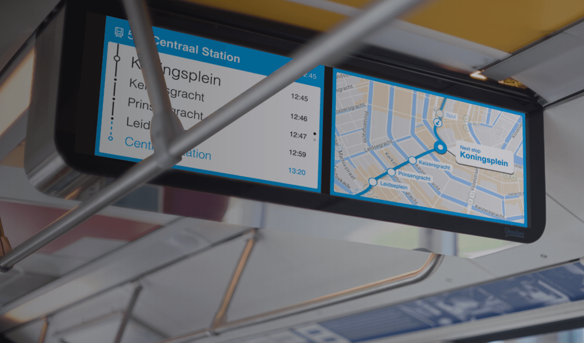
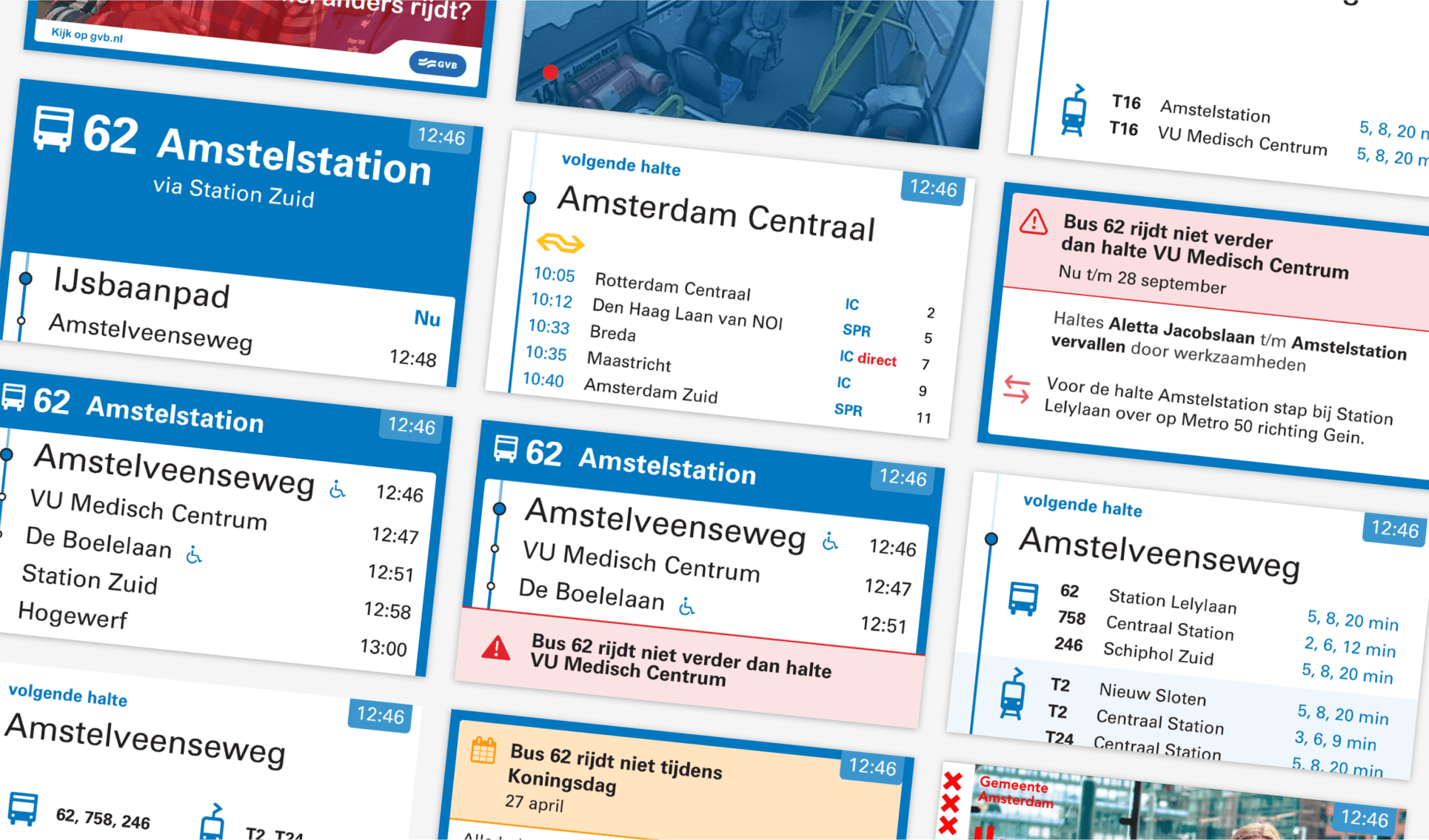
Choreography is essential because the need for information changes between stops. When entering the vehicle, passengers need confirmation that they have entered the right vehicle, going in the right direction Between stops people may want to know their estimated time of arrival and possible disturbances. And at the stop, they want to know whether they need to exit.
Here the second principle, Contextual information, becomes crucial. When the vehicle approaches the stop, we provide location-based information on points of interest and transfer options. This allows travelers to make an informed decision on the remainder of their journey.
All of this information needs to “glance-able”. Meaning we carefully dosed it to avoid overload. People should be able to enjoy their view or their read, without the need to keep their eyes glued to the screen. To allow for this, we specified a specific chime to go with disturbances, meaning that experienced commuters are only exposed to the information that is relevant to them.
Based on the principles above, we got to work. We informed ourselves about the geo-fencing technology that would allow us to pull of the choreography and started designing. Because of the time-based nature of the design, we decided to start prototyping right away, constantly fine-tuning the timing and the amount and nature of the information between stops.
For this we developed a streamlined process where we would transfer content created in Sketch to the vector-based animation tool called Principle. This allowed us to iterate very fast and discuss the feasibility of our ideas with the GVB developers in a timely manner.
To ensure the readability of our designs we organized an in-house user test with a representative set of screens and reading distance. Neutral participants were asked to answer questions about information they were allowed to see for a limited time. The results allowed us to dial in things like font-size and the amount of lines on the screen.
Grand finale : User test in a riding bus
The real proof of the pudding is experiencing the design in the actual context. Together with GVB we chartered a test-bus that ran a real route in Amsterdam (we even had the matrix sign on the bus say “Test”). Along the route the bus picked up and dropped off participants, while the system would display real rout info on the screens.
VanBerlo user researchers then interviewed participants to gather reactions and opportunities for optimization. These would then be incorporated into the final design specification.


