UX/UI Design / Research
Atus
Lead Designer & Project Lead
Merging the best of two worlds
Why not use your phone or a smart watch one may ask. We asked the same. The first reason is that watches are not allowed in many situations, as are phones in some cases. In addition to that there are too many variables to manage: Is the phone charged? Is the OS up to date? Is there malware involved? Are there privacy issues? How about distraction?
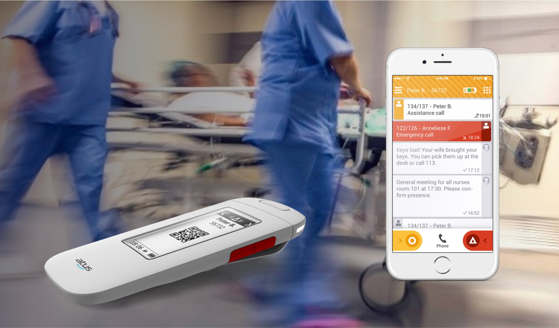
Pagers do not raise these concerns, but offer a pretty poor experience as they only display one line of abstract numbers. We knew we could do better. So we set out to merge the best of two worlds.
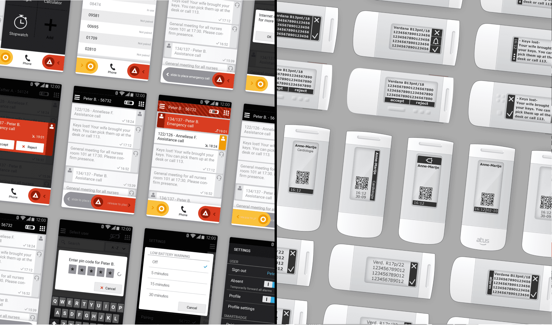
A dedicated e-paper equipped device to handle all safety-related use cases and an optional companion app to catch you up during your lunch break or shift changes.
Both to develop these starting points and to validate them we organized a number of hospital visits. We talked to both nurses and the IT professionals responsible for managing & maintaining the hospital information system and we learned a lot. The IT people made us realize the scale of their operation and the importance of absolute reliability. And the nurses gave us an insight in their day-to-day tasks and workload.
One of the more peculiar things we learned is that nurses hand over their pager to another nurse, during lunch breaks. This means that many nurses walk around with two pagers in their pocket, and all the possible confusion caused by that. We created a quick wooden mock-up of the form-factor of the device to gather much-deeded feedback from them. This validated our starting points and provided us with the input to enter the detailed design stage.
Simultaneous Design
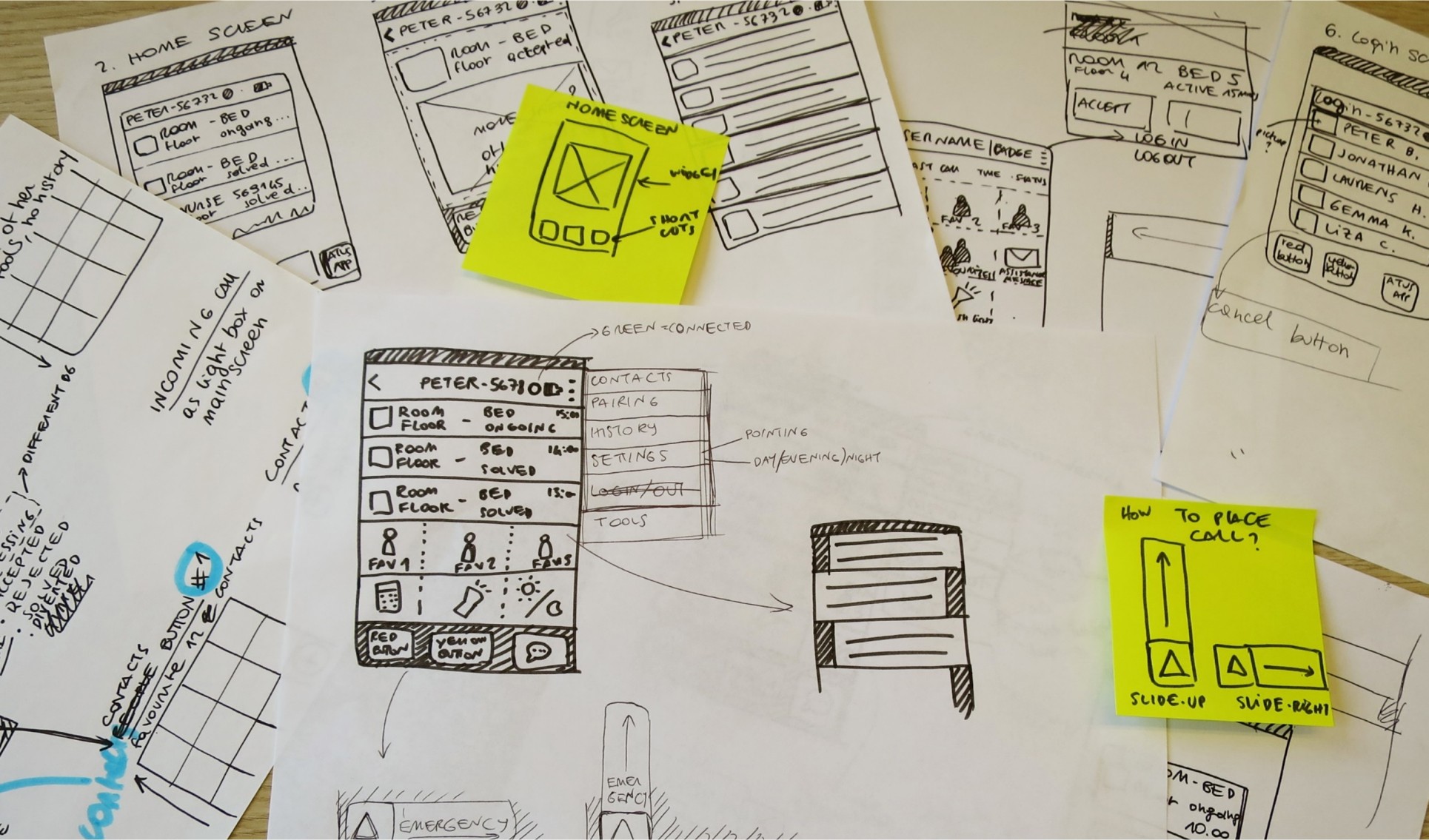
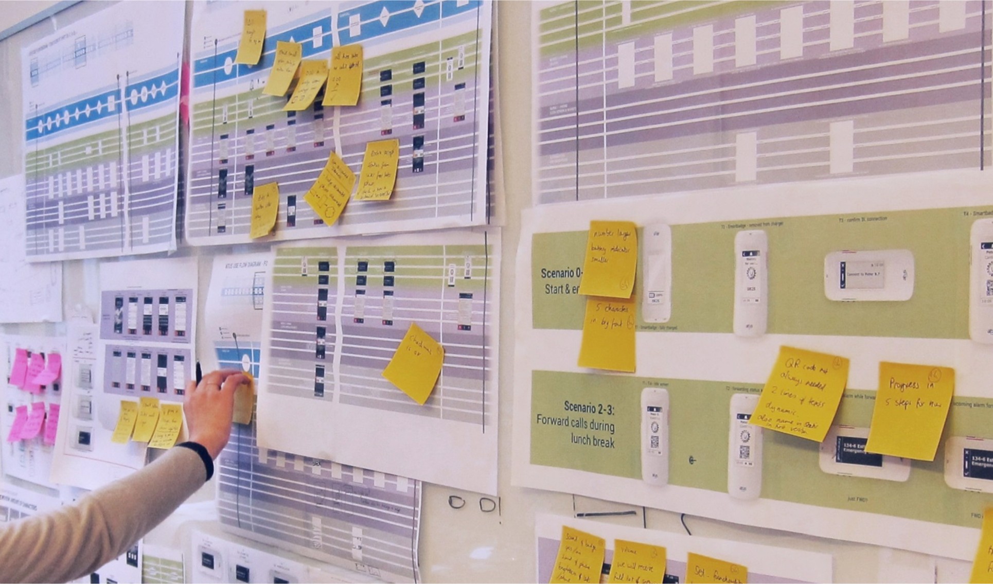
Since there are two end-user touch points in the system, we had to carefully balance which functionality is required in the device and which was more suitable for the companion app. In order to do so, we developed a design and documentation system in which each use case is mapped out in two parallel "swim lanes", much like an omnichannel journey map. One lane for the device and one for the companion app. This helped us to keep the functionality of the device as simple as possible, while making sure that any "gap" in the device functionality is handled by the companion app.
One of the more interesting aspects of the project was designing for the strengths and limitations of the e-paper display on the device. We created a quick prototype that allowed us to upload test screens to the display to test various font types, font sizes and line heights. And it turned out that old-school fonts that were designed for the low-resolution monitors in the nineties worked best. After a lot of iterations both in digital and physical form, we landed on a pretty innovative solution.
Below you is a short video of it (video produced by Atus)


